How to determine what metrics you need for an A/B test
Image by Alice Coburn
Is there such a thing as a failed experiment? The standard answer is ‘no because you’ll still have learnt something’. And there’s undoubtedly some truth to that. But there’s only so much you can do with “well, that didn’t work” other than give up and try something else.
You see, there is such a thing as a failed experiment: it’s when you don’t learn anything actionable.
I share this diagram a lot:
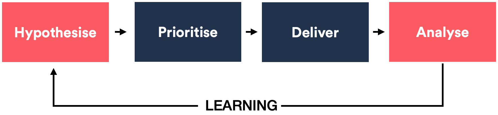
Whether an experiment wins, loses or draws (most experiments will be of the latter two), it’s essential to know as much as possible about the circumstances leading to the outcome*.* In other words, we need **data** to help us decide what our next step should be — that could be to either abandon the hypothesis entirely or iterate by tweaking.
Analysts are usually the ones we ask to provide such insights. Implicit in this ask is that they have the data to mine in this way. This data is often unavailable, and as a result, we’re often asking a lot of impossible questions to our analysts.
What we need is to have enough foresight to build the necessary metrics for each experiment before it launches. But how do we do that?
The good news is that there’s a simple process we can use to determine what these “right” metrics are. The process involves predicting the possible outcomes of our experiment and then working backwards from there to figure out the metrics we need.
You don’t have to be an analyst to do this, and the process is fun. I often encourage designers and product owners to get involved in this process.
Here’s how it works.
Step 1: List each possible outcome
We start by listing the potential outcomes of an experiment. This usually starts with the following list:
-
The experiment is a conversion win
-
The experiment is a conversion loss
-
The experiment has no impact on conversion
Yes, I said this is a start because a potential outcome could be more complex and nuanced than what’s shown above. For instance, you might consider an outcome where you’ve increased conversion but have decreased ATV (Average Transaction Value) — both are primary metrics.
Don’t overthink this, though. So, if you’re unsure, just stick to the above three outcomes.
So, now we have a list of our potential experiment outcomes. Next…
Step 2: Brainstorm reasons for these outcomes
This is the fun part. Give each outcome its row in a table and then brainstorm the possible reasons for this outcome. We can use this statement to help: “I think this [this outcome] could happen because of [this reason]”.
Think of both positive and negative outcomes. List as many statements as you can.
Here’s an example:
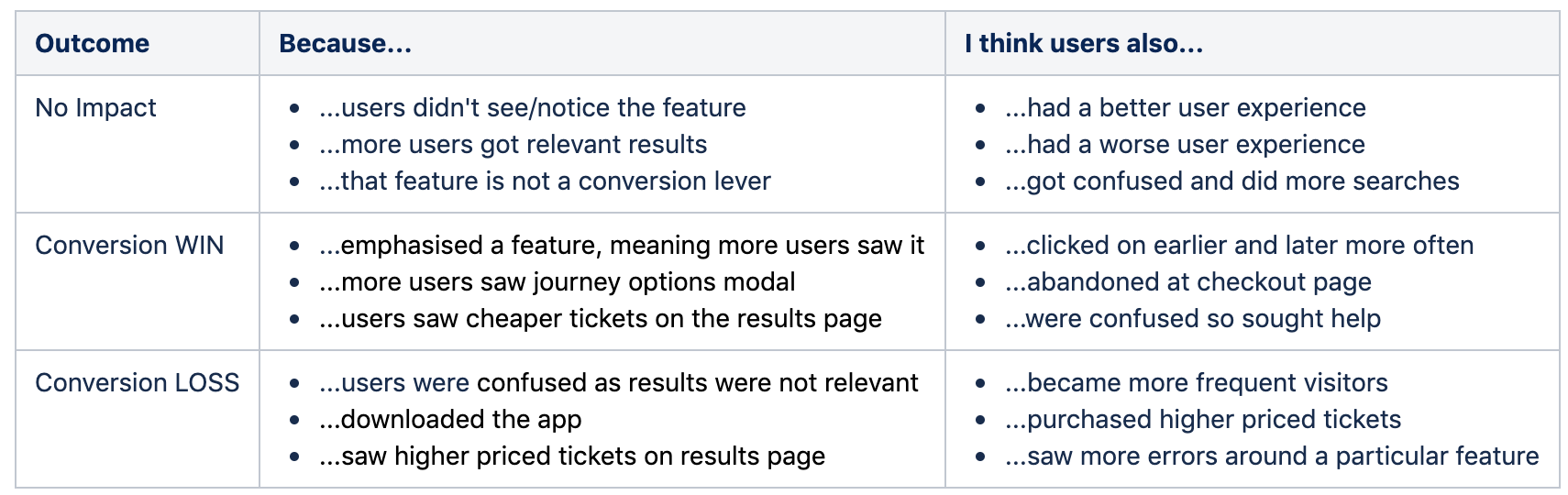
In the above example, we’re also noting other possible behavioural impacts (even if they don’t impact the outcome of the test).
Note: it’s often thought that considering negative impacts like this is being pessimistic. That’s not true. It’s objective to admit that these consequences are possible, even if we do believe them to be unlikely. And it’s constructive because there’s a purpose to this process.
If you have it, refer to user feedback or user research to back up the possibility of said behaviours occurring. User-testing is also a goldmine for information. But none of these is essential for this thought experiment.
Now, to get a list of our metrics.
Step 3: Decide on the final metrics
We’ve now hopefully got a good list of possible behavioural impacts of our experiment. Now, let’s determine what metrics we could use to prove each of these statements.
Ideally, we should have someone with a decent analytical mindset for this — say, an analyst if possible. They’ll be able to tell you what the possible metrics could be and how they could be used — for example, as a segment or filter. They’ll also tell you if these metrics already exist.
If analyst resource is scarce, go ahead and complete the list anyway and get them to review afterwards.
Remember, analysing experiments is all about comparisons. This means that a useful metric is one that is available for both test and control groups.
Here is an example table:
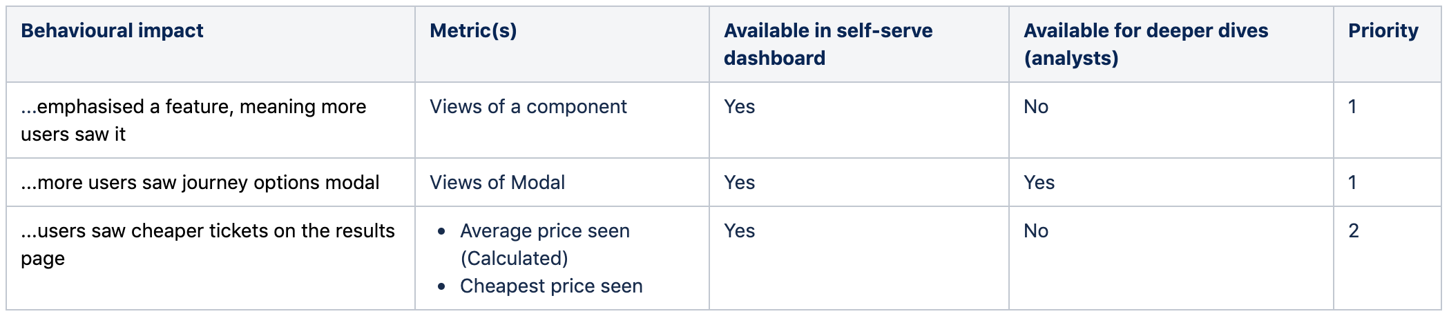
Each row is a different behavioural impact. For the columns, we have the “Metric(s)” — this is where we mention the relevant metric. We also have the following other columns:
-
Available in the self-serve dashboard — this tells us whether this metric will be available in the dashboard provided by our experiment tool — either that or another dashboard available for our team to self-serve.
-
**Available for deeper dives (analysts) **— this column tells us whether the metric will be available in the main analytics package used by analysts (e.g. Adobe or Google Analytics). There may be a discussion here regarding the value of building potentially temporary metrics in this way.
-
Priority — we could have a daunting list of metrics that we want to build. Building all of these may not be realistic. The priority column ensures we weigh up the benefits vs the cost of each metric. Having a priority ensures that build the most crucial secondary metrics.
It might also be useful to determine the potential volume we’re expecting for a given metric. It might help you decide whether or not it’s worth the build. I’ve not added it as a column here because I usually consider this along with the priority. But decide if this could be important for you to split into a separate column.
Note: it’s useful to have as many metrics in the “self-serve column” as possible to allow the entire team to see the performance of this metric quickly. This helps avoid “analysis paralysis” where analysts have an endless array of metrics to check. Self-serve metrics should be easy to consume with as little friction as possible.
In general, ensure that metrics are quick to develop and use — avoid overengineering and balance thoroughness of a metric against the time it takes to build them.
Conclusion: Metrics in use
An experiment is only as good as the metrics that are tracked. And with the right metrics, you’re giving your experiment the best chance to talk to you and tell you what’s happening.
Following this simple process, either on your own or as part of a team, will ensure that you not only have the necessary metrics for each experiment but it also means you have a deeper understanding of each experiment in general.
Never assume that the metrics you need are already being tracked. Always involve the right people (analysts) in this process if you can.
Once you start tracking metrics like this, you’ll have fewer experiments that you class as “failed”. You’ll also discover many fascinating insights about your customers and how they are using your product or service.
Thanks to Alice Coburn, a User Experience Designer who created/supplied the main image for this article.