A visual guide to counting traffic into your A/B test
You’ve no doubt seen variations of the following diagram.
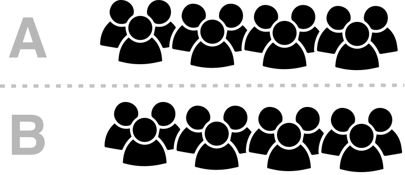 A typical A/B test diagram
It describes how traffic is split for an A/B test.
A = existing page (aka our “control” group)
B = the new version of our page (aka our “variation” group).
In the example above, users visiting our site get split evenly and randomly between A and B.
But did you know that there is actually an unspoken group, hidden in this diagram? — i.e. users not in the experiment. Adding this group does make things more complex to think about, but in return it makes it clearer and more specific about who we’re counting into our experiment.
You see, what you have to remember about A/B testing is that we need to ensure we have the right people in the experiment as ultimately we want to be able to compare the results between the two groups (A/B testing is all about being able to compare two groups of users).
Normally it’s not vital that you know about this as most A/B test frameworks will handle counting for you automatically. However, there is a benefit to knowing and understanding how traffic is counted as it gives you a better understanding of what is happening to your traffic and why.
This is especially the case if you are running A/B experiments where the variant is developed within the application itself. It is also important when you have a single page application as we have. So we need to be much more deliberate about who we count into our test.
Some basics
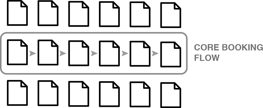
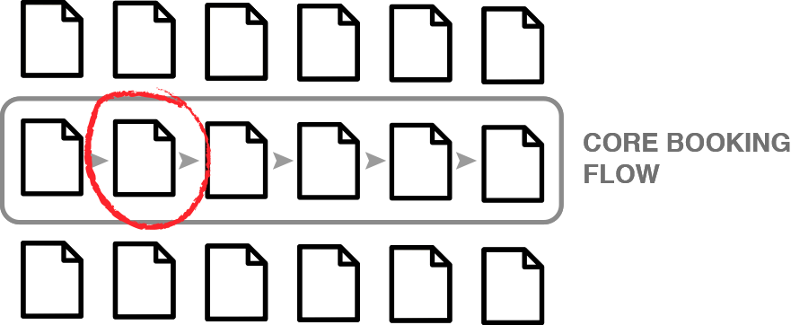
Let’s start with a simple visual representation of the pages of our site. The core booking flow represents our main conversion funnel…
Here is an example user.

Imagine this user has hit the following pages of our site only…
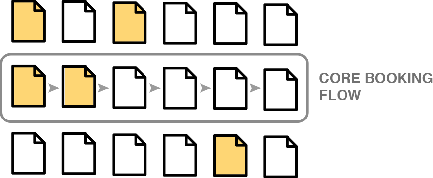 Pages that a user has hit
Let’s represent this user and their page hits as a simple dot.

A user with page hits
We’ll have many users on our site. Each user, hitting different pages…
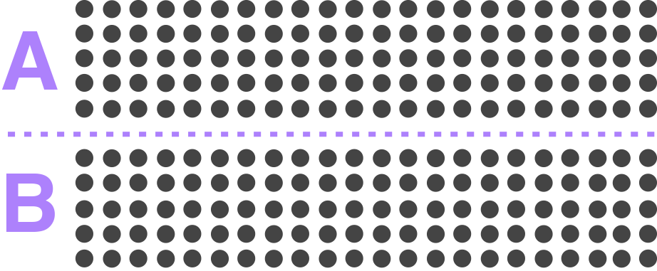
 Many users and their respective page hits
Now, here’s some important bit of information about our site traffic: when a user first enters a site, they are assigned to the tests they match.
Some of these users are placed into the variation group (B) of a given experiment, while others are placed into the control group (A).
This assignment happens randomly across all of our active experiments for every user hitting our site.
Here is a visual representation of those assignments for a single experiment…
 People are assigned on entry to our site
It’s worth noting that returning users retain their previous assignment.
It’s also worth noting that at this point I’m talking about “assignments to the experiment”. All these users have not necessarily experienced the relevant conditions of the test.
Okay, so now with these basics out of the way, let’s create some example experiments…
Example 1: A simple page level experiment
Our first example is a simple A/B experiment on our search results page. That’s the following page in our conversion funnel…
This is our search results page
Our test criteria for counting into the test is…
Users who have hit the search results page
We can represent the traffic in our test as follows…
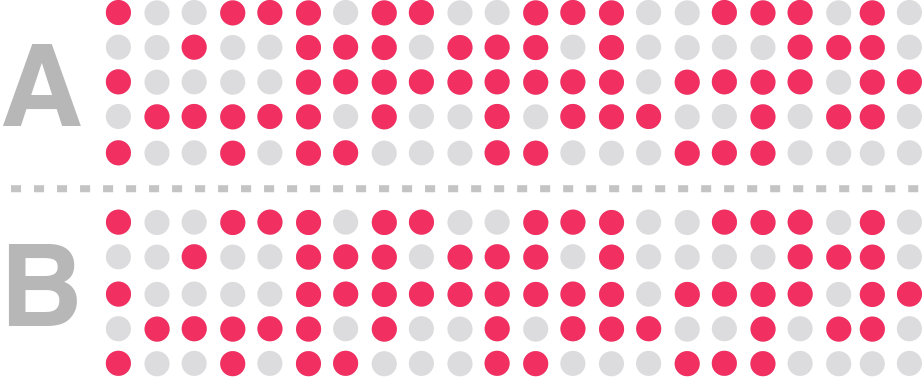 Red indicates users who have hit the search results page
I’ve marked red, the users of our site who hit the search results page (our test criteria). I’ve marked grey, those who have not.
So basically, the red dots indicate users who have experienced the conditions of the test and are therefore counted into the test — i.e. we’re interested in them from an analysis perspective.
As you can see, we effectively have three groups:
- Users who are counted into A (the control group)
- Users who are counted into B (the variation group)
- Users are not counted (do not match our test criteria)
Here’s what you need to take away from this example
- We have a similar number of users in A and B groups
- Users counted into the test are only those who have matched our test criteria
- We’re not counting users who are not relevant. They’re regarded as noise in our test
The above points are important when it comes to analysing our test results. When we compare our A and B, we only want to include users who match our test criteria.
We also want an even distribution between the two groups.
Basically, we want to be able to compare the results effectively.
For example, we can’t compare the results of a test if the split between A and B is like this…
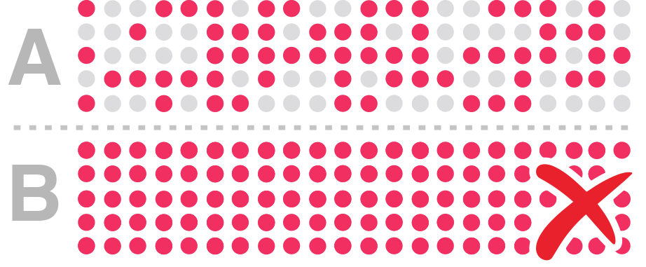 Red are users counted into our experiment
In the above example, the sizes of the user-base counted into our experiment is unequal. Our B group also has users who don’t qualify for the experiment, so there is a lot of noise in B group.
Comparing the conversion rates and other metrics of the above test may be misleading because of this noise.
Technical learnings
From a technical perspective, here are the takeaways…
- Users are assigned automatically on entry to our site by our testing tool
- We need to understand how and when we count users into an experiment
At Trainline, we actively describe and set up when, and where, to count a user into an experiment. To do this, we actively send a “count” event from our application to explicitly count users into experiments.
This allows us much more flexibility with our counting (you’ll understand why this is so important when we go over our examples).
Test criteria as a metric
Okay. So, we count users who match the test criteria. We also need to ensure that we have this test criterion as metrics.
You see, as well as counting a user into an experiment at the correct time (which will happen once per user per experiment), we also need to ensure we have a metric to send an event every time a user experiences our test conditions.
Why do we need this? Well, so far we’ve been imagining our dot as a user with a “hit” matching some specific test criteria…
 Red dot = user counted in our experiment
…whereas in reality, a single user may make numerous visits to our site. In some of these visits, the user may match our test criteria, and not in others.
To get a better view of this, let’s visualise visits where test criteria have been experienced as a red arrow…
 Red arrow indicates a visit where test criteria are experienced
…and visits where tests have not been experienced as a grey arrow…
 Grey arrow indicates a visit where test criteria are NOT experienced
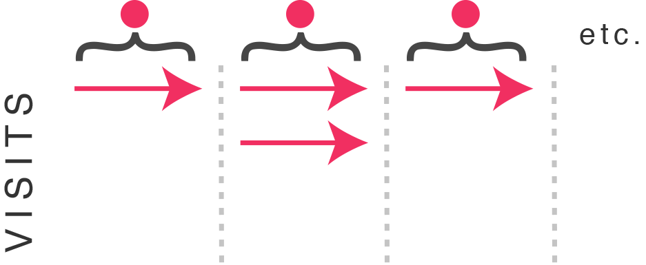
Below I’ve expanded each user counted in our test (the red dots from before) to show their respective visits (arrows). So the user on the left has made three visits. The user in the middle has made four visits. And the the user on the right has made two visits.
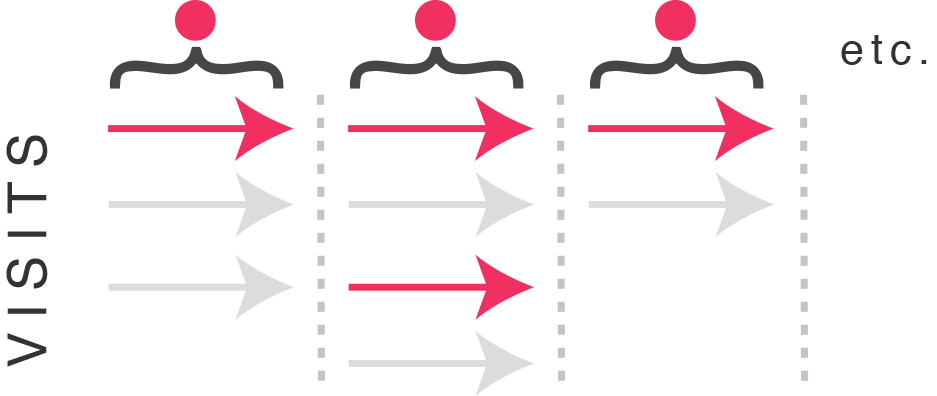 Each dot is a user counted into our tests, expanded to visits
I’ve put a red arrow to indicate visits where test conditions have been experienced and grey where they have not.
What we want is a way to filter test data to only show visits where the test has been experienced…
 Removing all visits not experiencing test conditions
This is why we need the test criteria as a metric. As this metric enables us to segment so we can see only the visits which have experienced the test conditions.
This is important because it’s possible that the difference between A and B is diluted by a potentially large number of visits where the test conditions have not been experienced.
That means that the above view is the purest look at our experiment. Again, what we’re trying to do is compare A and B in order to analyse the difference between them.
For this example experiment, setting up this metric is easy — in fact, we should already have page-level metrics on our site.
This may not be the case for all experiments, however…
Example 2: A slightly more complex test
Our previous example works where all traffic to a given page is considered part of the test (eg. our “search results” page).
However, what we know about our search results page is that there are multiple “states” that users could see/experience.
For our second example, let’s imagine that we have a test for only a specific page state: single searches. Our test group is, therefore…
Users who have hit our search results page and have made a one-way journey search
That means that a user is only relevant for the experiment if they experience this state of the page.
If a user does not experience this state, then we’re not interested in them for this test and so we don’t want their visits to influence or add noise to our test.
Let’s represent this group visually…
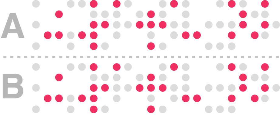 All search results pages, where “single search”
The above diagram shows only users who have hit the search results page, only this time our “counted” group are those who have done a one-way journey search. So one-way journey searchers are a subset of search results page hits.
What does this mean for our test setup? Well, it means we have to be more specific about the users we count.
Our requirements for this test has not changed. We still want an even distribution between the two groups. We also only want to capture only the users who have experienced the test conditions in both test groups.
Again, we need to ensure we have a metric to capture this scenario so that our analysts can segment at the visit level. This metric may or may not exist.
This is where it has become even more important and useful to have a mechanism to count users into relevant experiments.
Now, while this is a slightly more complex example than our first experiment, our next example is even more so…
Example 3: Testing a new feature
Imagine we have a feature that only shows under specific circumstances — eg. a message that appears once in a user’s visit (or once every set number of visits), to warn them of potential journey delays.
The counting rule for this test might look something like this…
Users who have hit our search results page and where there may be delays.
We already know that we definitely don’t have a metric for this group. Perhaps because there is an API call that determines whether there is a delay or not.
When this feature is developed it’s common for it to be developed as follows…
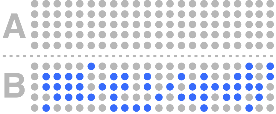 Blue indicates users who have experienced a feature in the variation group
Here, blue indicates that the message has been shown to the user. This functionality has been developed into the application as part of the variation only — the functionality does not exist in the control group, hence no blue dots for the control group.
So how do we count users into this experiment? What we might do is to count users based on the delay message being seen. Which would look like this…
 Counting users in our variation group who have experienced the feature
You can see in the visual why that is a problem — i.e. we have no users counted into our control group. How do we fix this? What we need is some sort of equivalence for the control group too.
This is what we need to see…
 Red are users who have experienced our feature
One approach to this problem might be to approximate this group through pre-existant metrics, chaining together in order to create a rule that captures this group as closely as possible. However, this may be difficult to do for some experiments (like this one).
Remember, we not only need a way to count users into our experiment, but we also need to measure when this feature has been experienced at the visit level.
We’ve uncovered a problem, but it’s good to have uncovered this before we even begin development of the feature. This way, we can ensure that we build the feature in a way to make “something” available in the control group. It helps us avoid potential analysis-hell, where analysts have to somehow create a control group retrospectively.
Don’t do this to your analyst…
Our third experiment is a very good reason to be particular about counting users into our A/B experiments and knowing why we need this.
So what have we learned?
In this article, we’ve explored the difference between “assignment” and “counting”. They’re not necessarily the same thing. Assignment happens automatically but at Trainline we’re very deliberate about how we count.
We do this because we need to be able to effectively compare the difference between our test groups without having the noise of irrelevant users getting in the way.
We also need the counting criteria as a metric so we can get a clean look at our test results if we need to.
And finally, we learned to be careful when developing new features and consider how we plan on counting users when we set up the experiment.