8 powerful levers for Conversion Rate Optimisation
8/13/2020
Conversion Rate Optimisation can be a wildly chaotic exercise — like blindly throwing hundreds of darts hoping that something lands on a dartboard. It helps to be purposeful in terms of the approach we take. Utilising conversion levers to track the success of experiments is a step in the right direction.
There are eight conversion levers I’ve relied on for years with the experiments I’ve run with teams — they’ve served us well. These levers are:
-
Value proposition
-
Clarity
-
Friction
-
Relevance
-
Social proof
-
Urgency/scarcity
-
Authority
-
Confidence
How to use these? Firstly, it’s useful to mention the levers when writing hypotheses. I use the following template:

1 and 2 are the variables involved. 3 is where the conversion levers come in.
Mentioning conversion levers as they relate to a hypothesis enables to track the success of each lever. This leads to a better chance of increasing the win rate of an experimentation program. Plus, believe me, mentioning the conversion levers is super useful if you need to track hundreds of experiments across multiple teams!
In this article, I’ll explain each of the mentioned conversion levers using examples as I go. Bear in mind that these examples are to demonstrate the principles — there are many ways to apply these principles.
Also, bear in mind that this is not an exhaustive list, but rather a list of conversion levers which have worked well for me.
Value proposition
A value proposition communicates the product or service offered. It should do this concisely and succinctly while also indicating what makes the brand unique.
Value proposition does not need to be a written statement only. It could **demonstrate **it like in this example from Slack:

Slack not only state their value proposition in a clear statement, but they also present a nice visual on the right to demonstrate their value proposition in action (by the way, that visual animates to show a conversation “happening”).
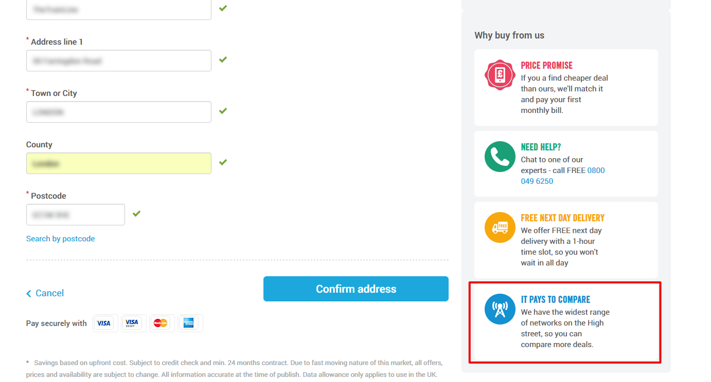
Value propositions do not have to be limited to a homepage only. Carphone Warehouse reminds users in the checkout flow that they have “the widest range of networks on the High street” meaning users “can compare more deals”:
You can display alternative value propositions based on what you know about the user. This can help you make the statement relevant. For instance, if I search for mortgages, and click on the “Money Super Market” result, I get this message on their landing page:

More on relevance later.
Note: you don’t need to be a marketing expert to create a good value proposition. I worked with a startup company recently who didn’t have a marketing specialist to hand. We utilised the following formula from Chris Goward (from his book “You should test that!”):
Perceived Benefits — Perceived Costs = Motivation
Together, we created a list of statements and words for** perceived benefits as and perceived costs**. These lists were used to develop some great value proposition statements, highlighting the benefits while addressing perceived costs.
Here’s another useful resource for learning more about value propositions.
Clarity
Web design is **a form of communication **and, as with any type of communication, it is important to be clear and concise with what we’re trying to communicate.
We can say that faster the cognition rate of information is, and the more accurately that information is received, the higher the clarity.
It stands to reason then that the fewer the possible actions are and the less information you have to convey, the easier it is to convey all that with clarity. Daniel Levitin states in his book “The Organized Mind”:
“The processing capacity of the conscious mind has been estimated at 120 bits per second. That bandwidth, or window, is the speed limit for traffic of information we can pay conscious attention to at any one time.”
Think of “bits” as chunks of information similar to computer terms.
In other words, the bandwidth for new information is low. We should all be mindful of this fact, and not exceed this limitation.
Take the example below:

Netflix clearly and succinctly tells you what their product is (with a concise and clear value proposition). It’s also easy to see what action they want users to take (i.e. sign up).
Below is another example of clarity, conveying to the user what step in a process they are on and how many steps a user has left to complete.

This visual communicates with clarity. Especially with the green highlight and the number of steps which is repeated for easier cognition.
Clarity not only includes Information Architecture at a page-specific level but also in terms of site structure too.
We can look to user experience books such as Steve Krug’s “Don’t Make Me Think” for guidance about how to design sites for clarity.
We should also, if possible, conduct user testing and user research. And we should use feedback forms to capture feedback about areas of low clarity — look for places where users are confused or have misunderstood information.
Clarity has an evil twin called Distraction. Imagine if Netflix added many competing calls to action on their homepage. This would distract users from the action Netflix wants them to take.
This leads us nicely to…
Friction
In “Hooked”, Nir Eyal writes…
“Reducing the thinking required to take the next action, increases the likelihood of the desired behaviour occurring with little or no conscious thought.”
Distraction is an example of friction. And friction can be defined as anything that stands in the way between a user and their purpose for visiting a site.
We can find friction on a page level (where information is hard to digest) and also a site-structure level (where there are many steps in a conversion funnel, or where the information architecture is confusing).
Nir Eyal refers to Instagram as an excellent example of a company who have worked hard to reduce friction. The product works so well because it is easy to take and post photographs. The frictionless experience of using their product has contributed to their success.
Here’s another example — a search form from Yelp…
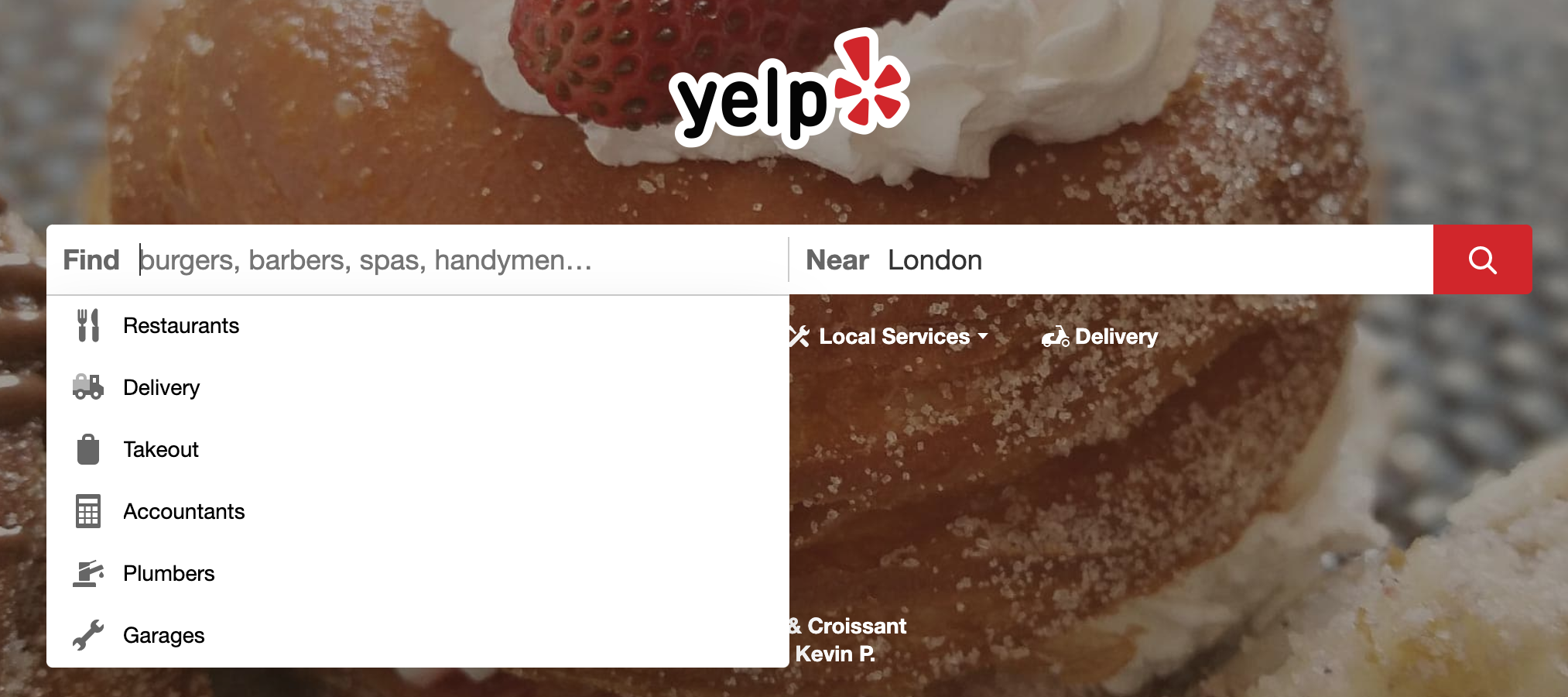
Not only is “London” pre-filled, but there is also a handy dropdown for easy selection. All this makes conducting a search easy and frictionless.
It’s important that we identify good friction versus unwanted friction on our site. For example, below is an example of good friction:

The friction here prevents us from making a mistake we may later regret.
We can also add friction for users wanting to cancel membership for our service:
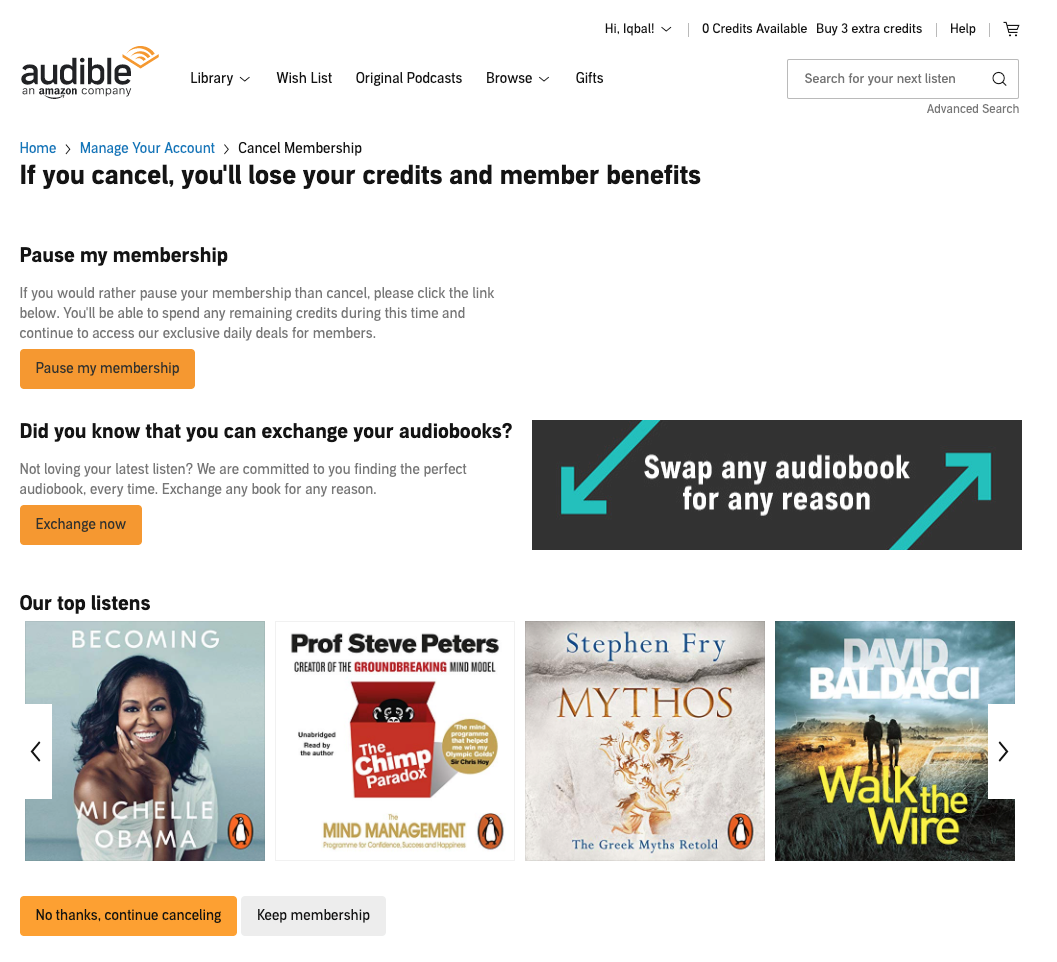
Here Audible provide some alternatives to cancelling, adding friction to the process of cancellation. Beware when adding such friction as it is possible to go too far with this practice.
We can also add friction so we can invest in improving user confidence in their purchase. There’s* more on confidence later.*
Relevance
We’re marketed to every day. Google, Facebook, Twitter, and others constantly bombard us with ads. In the past, the content of these ads was broad, nowadays the ads are much more tailored and specific.
The result of this specificity is that the ads have a much greater impact because they’re relevant to us. We’re more likely to engage with ads which are tailored to our needs and interests.
Understanding “relevance” means we need to understand **what our users need and expect from our site **and how closely those needs and expectations are met.
In “Always Be Testing”, the authors *(Brian Eisenberg, John Quarto-vonTivadar and Lisa T. Davis) *describe the idea of “the scent”…
“People hunting for online data behave remarkably like animals sniffing out prey.”
If a user conducts a search, the rest of their actions can be seen as following “the scent” to “hunt down” what they’re looking for. This means the closer our content matches user expectations, the **greater the relevance **is said to be, as it matches this “scent” more closely.
Google does this with their results (here, I’ve searched for “thermal printers”):
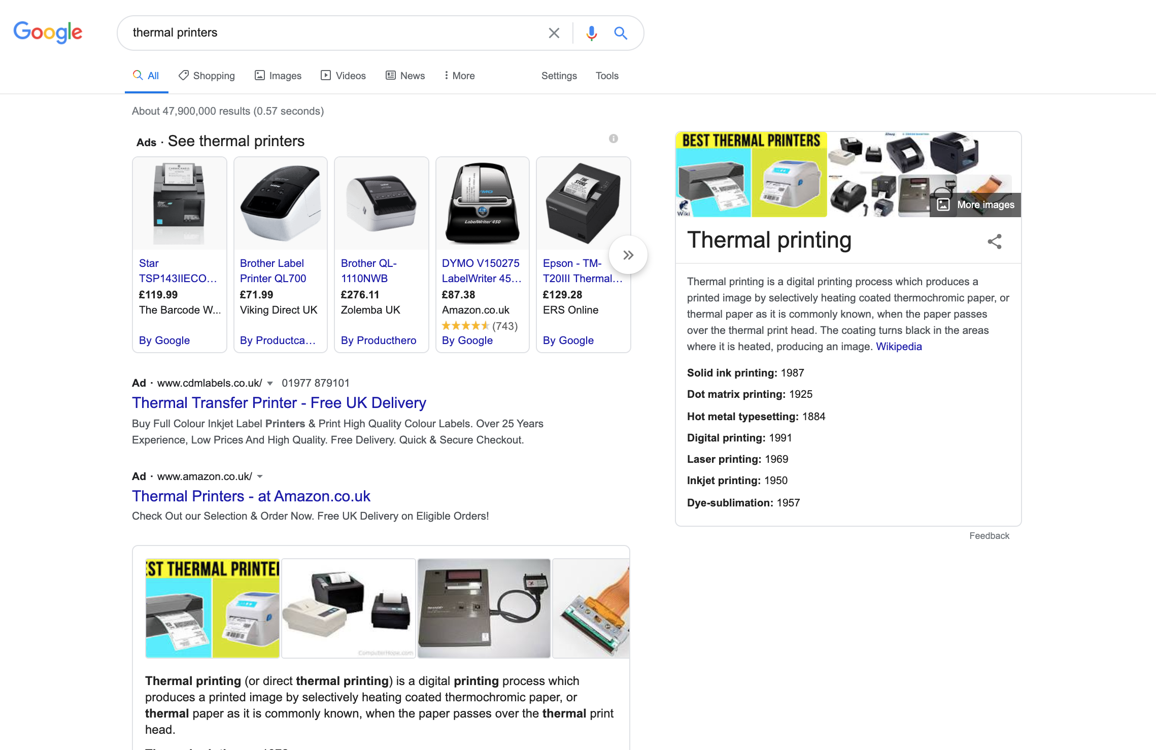
Google dedicates the first part of its results screen to various ads for purchasing thermal printers. They also add a section providing information about what a thermal printer is. The idea is for them to present something that continues the scent.
If I search for “thermal printers buy”, they do away with information about what a printer is since they know I’m interested in buying.
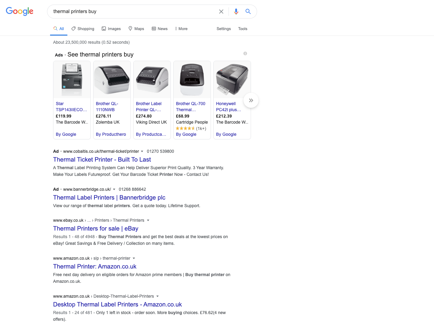
They’re being more specific with the scent, reducing the distraction.
Here’s another example of relevance in action with Amazon. I selected a thermal printer and, along with the product description, I get these two sections:
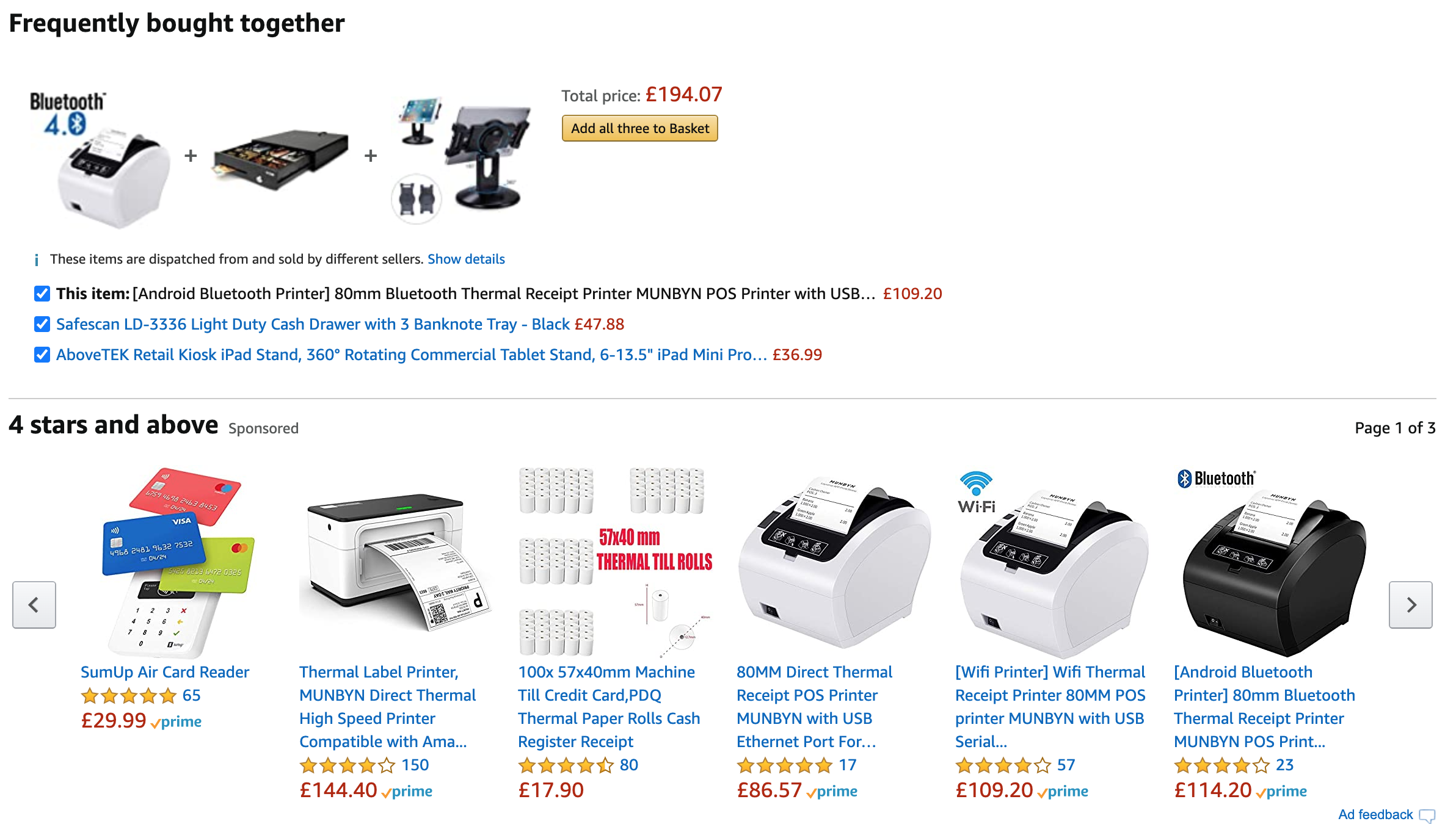
The “frequently bought together” section provides relevant products t**o purchase along with the selected item. The section **below provides high-rated alternatives relevant to the product I’m viewing.
Next, we’ve already come across the following example of relevance as it targets a value proposition with a search term — in this case, “mortgages”.

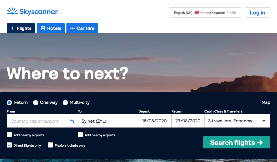
It stands to reason that the more information we have about a user, the better our chances of providing relevance. Skyscanner remembers our previous search and populates the destination as well as the number of travellers, making their homepage feel more relevant as a result (it also reduces friction):
If I search for hotels in the Lake District with Booking.com:
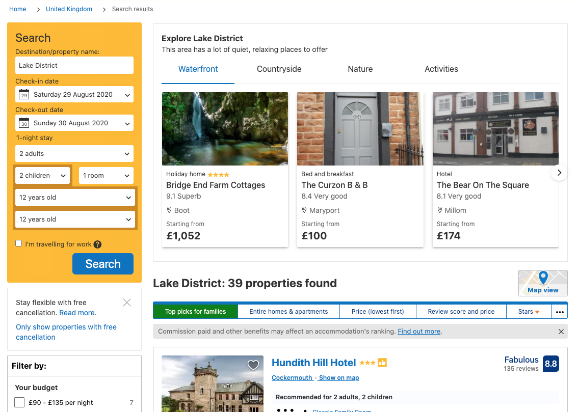
I get a section “Explore Lake District” with a variety of properties that hopefully hit on something relevant for me.
A good source of information when you’re looking to optimise for relevance is to try to understand user expectations. This can be done through user research, user testing, and feedback surveys. When launching surveys, ask users if they found what they were looking for. If they said no, what was their expectation?
You can also find useful data using whatever analytics package you use. Look for different segments and compare/contrast the conversions. For example, you can contrast a segment like travel searches with a single passenger vs. travelling as a family. If the conversion rate is different, brainstorm how you can improve conversion. One example might be to display relevant supporting information — i.e. information about travelling as a family.
Social proof
Humans are social animals and we automatically feel the need to conform with the masses. That’s why many comedy programs feature laughter tracks (though rarer these days). Laughter tracks were found to make an audience laugh longer and more often.
Social proof is one of the six persuasion principles outlined by Robert Cialdini in his book “Influence: The Psychology of Persuasion”. I mention a couple more of his principles on the list.
Here’s an example of social proof in practice.

The example above presents a section of bestselling audiobooks. So, if I was unsure what my next audiobook listen was going to be, I might rely on social proof to inform me of my next listen.
This effect can be strengthened by relevance — i.e. if I was a fan of thrillers, then presenting me with thriller audiobooks will enhance the effectiveness of this panel. The effectiveness of this panel is also stronger if I have a high level of uncertainty about what I wanted to listen to next.
Social proof can be a powerful tool when optimising your site. You could add reviews, testimonials and number of views to your site. The higher the average review is (and the more of these reviews there are), the higher we perceive the quality. Also, the more authority a reviewer has, the greater the impact of social proof, e.g:
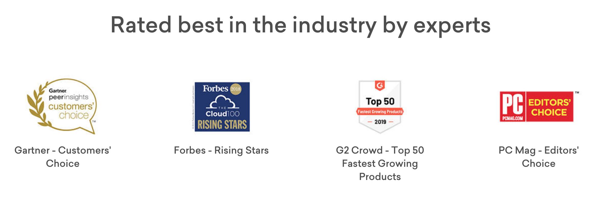
Knowing that the product is rated by these authoritative sites, leads to greater confidence in the quality of the product. More on authority later.
If you have different packages, you could present the most popular choice, to help anchor purchases:
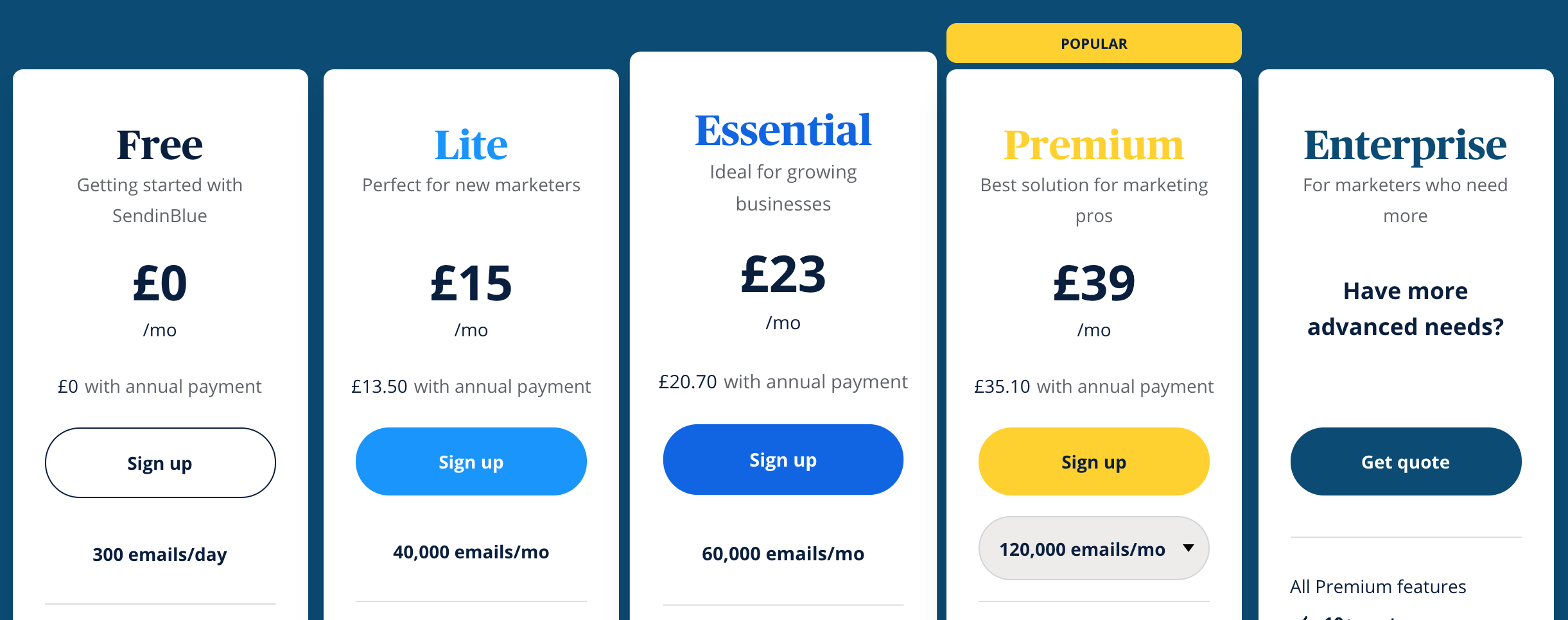
Finally, here’s an example where social proof is implied:

By preselecting £50, we might assume that it is a popular donation amount (which it probably is as a result of this preselection).
Urgency/scarcity
Another one of Cialdini’s six principles is scarcity.
Scarcity is also a fundamental principle of Daniel Priestley’s book “Oversubscribed”. The general principle is that the more scarce a product or service is, the more desirable it appears to us, and the more urgently we respond to its scarcity.
Scarcity can work in terms of quantity or **time **(or both).
Here’s an example of time-based scarcity/urgency with a flash sale:
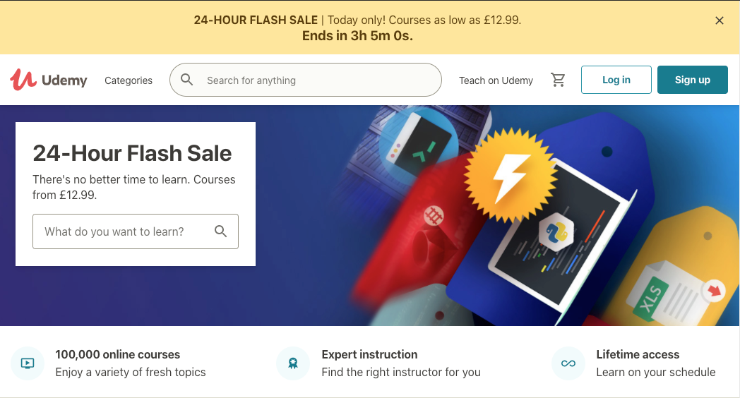
Note the countdown timer which further ramps up the feeling of urgency.
Here’s an example of quantity-based urgency:

If these examples feel aggressive, see the example below where scarcity is implied through the mention of a result as a “Rare find”:

Note how social proof (the average rating, along with the number of ratings) is used to accentuate the urgency by increasing desirability.
When optimising with urgency/scarcity in mind, be careful not to cause anxiety. For this reason, it’s important to also test removing urgency messages from time to time, especially if we’ve ended up with many urgency messages on our site.
Authority
In 1963, Stanley Milgram ran an experiment investigating the nature of obedience. Selected participants were strapped to a chair, while others were asked to administer electric shocks to them.
Subjects administering the shocks were told to give potentially lethal shocks to seated participants. If they refused, they were ordered to do so by an authoritarian figure. These authoritarians wore lab coats to make them look official.
The result of the experiment found that two-thirds of the participants were prepared to administer a lethal dose of electricity.
In a nutshell, authority is a powerful influencer to the way people behave. Authority is another one of Cialdini’s six principles of persuasion on this list.
Let’s look to Brain.fm to see authority demonstrated. On their homepage, Brain.fm position themselves as experts in the field:
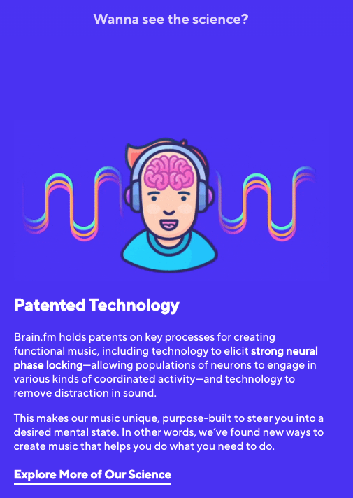
Not only is their technology is patented but they also don’t try and “dumb down” the science behind their product. If that wasn’t enough, they even link to further information which explores the research and experiments they’ve conducted, providing all their white papers on the subject.
Further down the same page they also provide links to major publications to further enhance this feeling of authority:

Leveraging known publications and brands is a common way to enhance authority. Here’s another example of this being used:
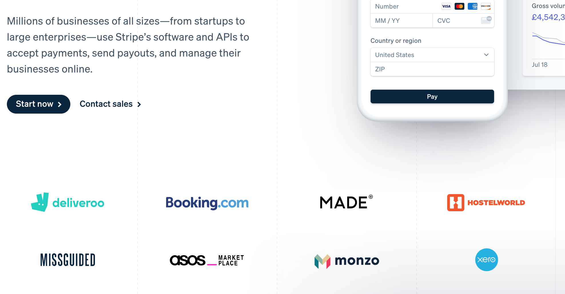
Stripe not only add logos of big-name brands, but they also add messaging that demonstrates their authority in the payment provider space by stating that *“millions of businesses of all sizes” *use their service.
Transferwise uses similar messaging by stating their “8 million people” customer base:

We can refer to the examples above as social-proof based authority.
One last example of this: writing books in a subject field adds authority…

…as does leveraging a person who has a celebrity and/or key-person-of-influence status.
Confidence
If a user is going to spend their precious time or money on product or service, they need to make their purchase decision with confidence.
In a way, many of the aforementioned levers contribute to promoting confidence to users — social proof and authority especially. Having said that, it is still worth looking at confidence as a conversion lever in itself.
We’ve looked at the following example before, but let’s look at it again. This time focusing on the confidence messaging:
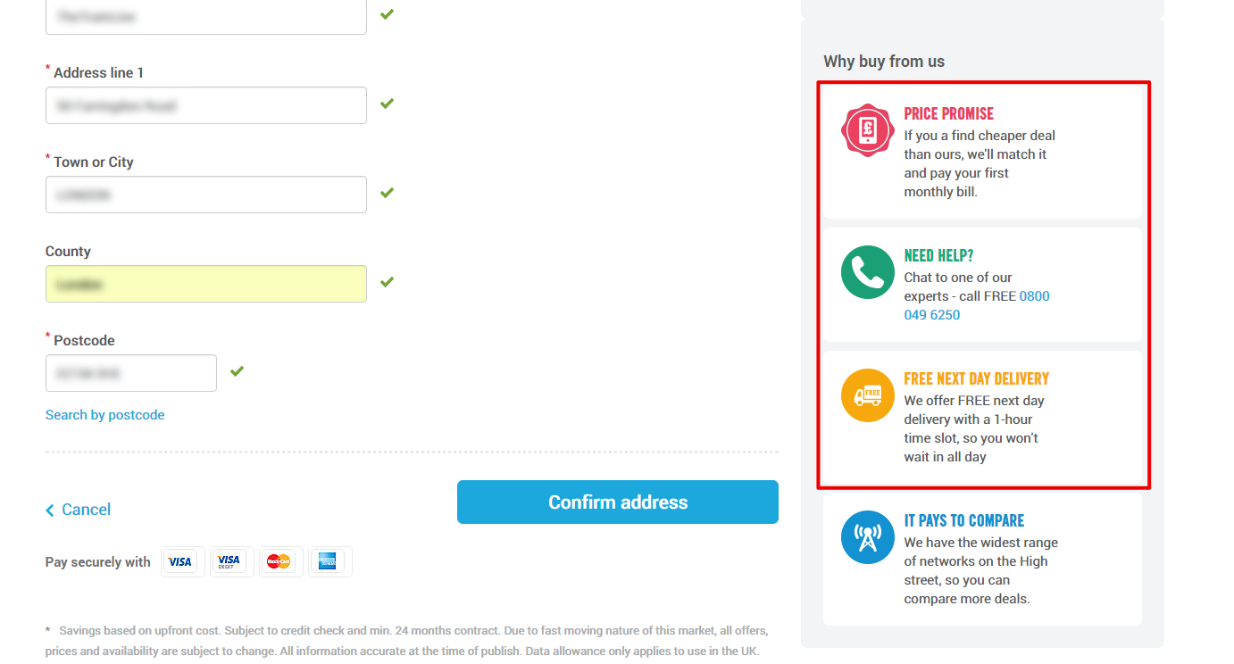
There’s a lot going on here: the price promise gives assurance that users will get the best deal on this site; the next day delivery message gives users a reason to purchase here, rather than going to the store (also assuring users that no additional delivery costs will be added); and the need help message assures users that the company is available at the end of a phone should they need additional help or support.
All of these messages work to give users a sense of confidence in their purchase. Here’s another example, this time adding some security confidence messaging on the checkout page:
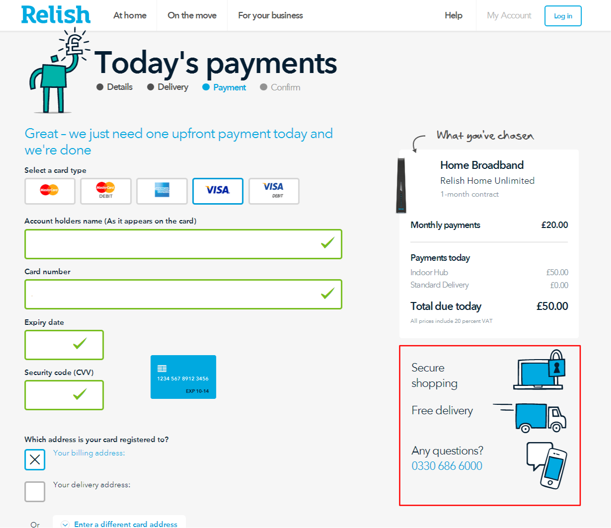
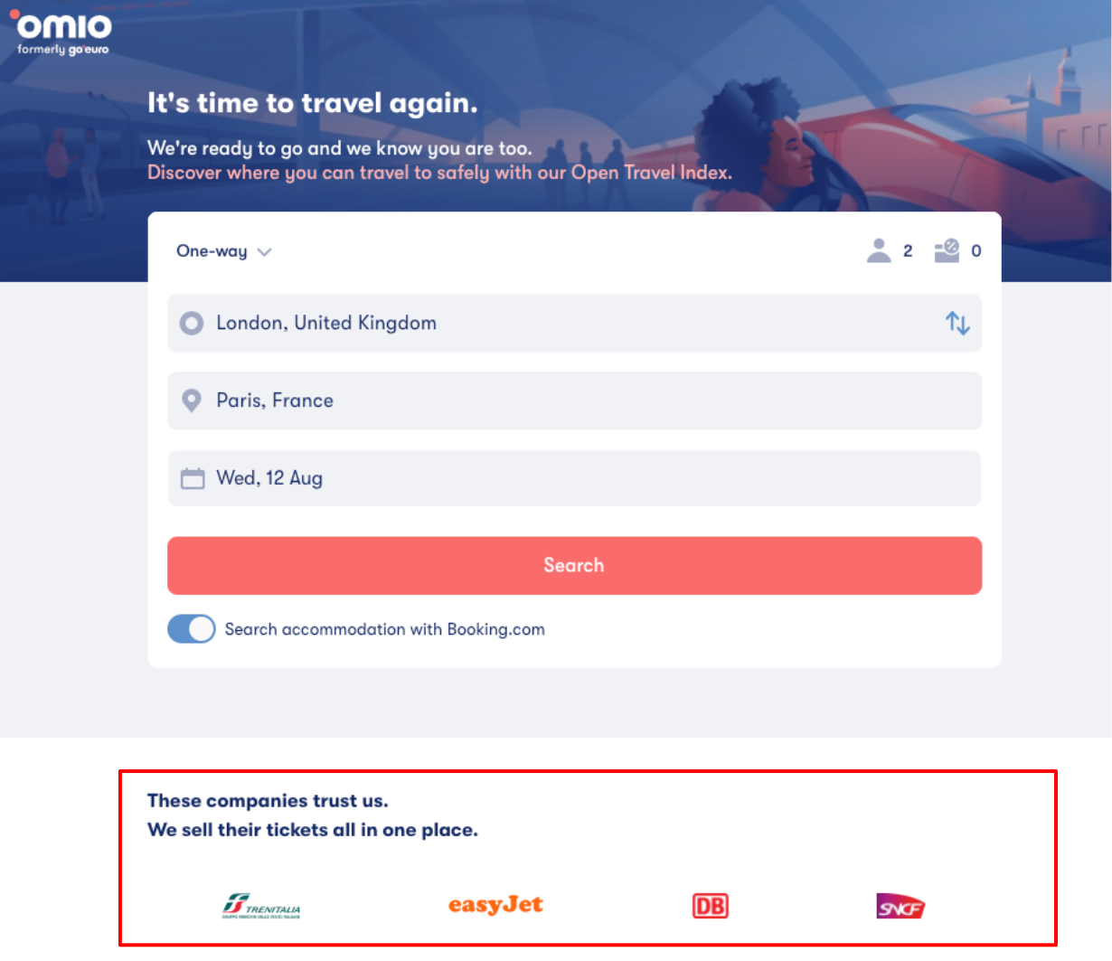
Confidence does not need to be added on the checkout page only. Omio assures users on the homepage that they sell various company tickets “all in one place” providing confidence to users that they’re seeing all options. They also assure users that those same companies “trust” them:
The following section from the Trainline homepage demonstrates some of the price savings available on the site. It provides confidence through price assurance:

An interesting study is highlighted by Richard Shotton in his book “Choice Factory”. The study found that, through the analysis of 111,000 products, the likelihood of a purchase is higher where the product is rated between 4.2–4.5/5, rather than 5/5. This thought to be because there is a greater perceived confidence in the ratings being “real” if they are not perfect.
Conclusion: conversion levers in practice
It’s important to note that there is no one size that fits all approach with the examples I’ve presented. An implementation which works for one site, may not work for another. The examples I’ve provided may not even work on different pages of the same site!
I’ve had teams fail with value propositions on a generic homepage. Pivoting to instead add more specific and relevant value propositions later in the funnel (where we knew more about what the user requirements were) yielded great results. The value proposition in question was added as an exit modal (adding friction to a user’s exit from the page).
So, it’s important to test the implementations of these conversion levers to see what works in your context.
Something you’ve no doubt grasped through the examples I’ve provided above is how many of the conversion levers can be used in unison. The experiment mentioned above used a **value proposition **enhanced by relevance while adding **friction **to a user’s exit (being wary to not delve into black hat practices of course).
You could equally have some social proof enhanced by authority which, in turn, can be enhanced by relevance.
So basically, conversion levers don’t have to be implemented in isolation. They can be used together where appropriate.
The connective tissue between conversion levers does not always occur in a positive way, either. For instance, removing friction can impact relevance negatively.
I’ve seen tests where simplifying search forms (in an effort to reduce friction and improve clarity) have failed. They led to a positive increase to the next step but had a negative impact further down the conversion funnel. This is because of the tests a negative impact on relevance.
So, be aware that one conversion lever could adversely affect another.
Another point which I touched on with the previous test example is how we could see one kind of impact immediate to the area being tested, but an impact in the opposite direction later in the funnel.
So, a positive impact early in the funnel could be followed by a negative impact further down the same funnel. And vice versa.
So, always check for impact beyond just the immediate vicinity of where the test is implemented.
Lastly, I wanted to reiterate that these conversion levers exist as **principles **and the list I’ve provided is by no means definitive or exhaustive. For example, I left out “performance” as it’s too complex an area to cover in this post (also, unless you’re using a testing tool like SiteSpect, it can be tricky to test for performance with testing tools).
So, to wrap this up: test to see what works for you, track results, and iterate. These conversion levers have worked well for me. I hope they do for you. Good luck!